I don't know what it is, but it's free:
http://www.cs.waikato.ac.nz/~ml/weka/index.html
http://weka.wikispaces.com/
http://weka.sourceforge.net/explorer_screenshots/PreprocessPanel.png
donderdag 29 juli 2010

What stats package to use?
Introduction
Boys like their toys, and this is not different with statistical packages. It's a perpetual and heated debate and when you've landed at some point and think your workflow is good, technology passes you and sets you back.
Here's an old discussion that I first consulted, but below I make my own considerations. In short: I'd use Python for big data, Stata for analysis, and R if I have to (e.g. for some graphs). Everything else I would ditch.
Stata
Stata is my program of choice. It is quite expensive, but mind you that for a couple of hundred euros, depending on the flavour, you'll not only get an easy and robust statistical software package, but also fast support, a good community, useful user commands, and a great documentation source. Fun fact: all documentation is read by the wife of the founder, who's not a statistician but perhaps even smarter. If she doesn't understand what the statisticians are saying, it goes back to the drawing board.
The bad things: forget about ever copy-pasting anything. You'll also need to have a lot of memory on your computer, as Stata loads the whole file and just one at a time (although you can 'preserve' a file temporarily to work on something else in between).
Python
Python is the next language I will learn. I have used chunks without understanding what I was doing, but I like the sound of the language, and it's the logical step-up after Stata, it seems. Many people are using it and so will I.
R
I don't like R. There is a thorough discussion here, circling around leaving Stata for R, but ending up in concluding what I conclude about: R is a mixture of a coding language like Python and a statistical language like Stata, but because it is open source the support is unsure, the community tends to be geeky and unfriendly, the documentation is poor, and the language consistency - even if the structure is good because it is a programming language - is bad. Some commands have their own inner programming language and that is plain bad.
The good things: it is free and R Studio is a great user interface. It has good graphic capabilities, and
Mplus
I don't know Mplus. Colleagues use it when there are issues with missing values, and the programmers are said to be the best statisticians in the world. So it must be good, but I don't use it.
SAS
This is old software. It is too complicated, and while it can do a lot through obscure options, it is not flexible enough to do what you want.
SPSS
This is bad software. It is a scandal that some universities still teach this.
Some R resources
Apparently the single best manual for R: https://r4ds.had.co.nz.- http://www.burns-stat.com/ - een man met een missie
- http://www.burns-stat.com/pages/Present/Excel_to_R_annotated.pdf - bewijst eigenlijk dat R graphics niet deugen
- http://www.burns-stat.com/pages/Tutor/R_relative_statpack.pdf
- http://www.burns-stat.com/pages/Tutor/spreadsheet_addiction.html

woensdag 28 juli 2010
Grapje
You have to love Stata manuals:
"Although some have said that there are as many cluster-analysis methods as there are people
performing cluster analysis. This is a gross understatement! There exist infinitely more ways to
perform a cluster analysis than people who perform them."
"Although some have said that there are as many cluster-analysis methods as there are people
performing cluster analysis. This is a gross understatement! There exist infinitely more ways to
perform a cluster analysis than people who perform them."
donderdag 15 juli 2010
Data Visuals
Een wetenschapper heeft twee taken:

- Verklaringen vinden
- Verklaringen tonen
Dat tweede punt kan op allerlei manieren gebeuren. Ten aanzien van collega's liefst zo exact mogelijk. Dat leidt tot tabellen, modellen en tekst. Maar er zijn nog andere mensen: beleidsmakers, consumenten, het middenveld, ... Zij vertrouwen een wetenschapper op zijn woord, maar geloven hem of haar pas echt als er een plaatje bij komt dat ze begrijpen. Zie daar de bestaansreden voor Data Visuals: grafieken die de vinger op de wonde leggen.
Omdat ik nu liever in mijn bed zou kruipen geef ik gewoon de links. Zoals gebruikelijk is er weer te veel informatie, daar kunnen andere informatiedesigners zich later over buigen. Enkele lessen:
- Edward Tufte is een referentie in het domein
- Pie charts deugen zelden, 3D pie charts nooit
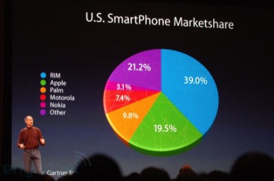
De links dus:
- http://lifehacker.com/5485624/look-at-data-like-a-statistician-minus-the-ph-d
- http://flowingdata.com/2010/02/17/road-to-recovery-is-the-recovery-act-working/
- http://img390.yfrog.com/img390/8971/he1.png - Bush vs Obama graph
- http://data.bls.gov/PDQ/servlet/SurveyOutputServlet
- http://flowingdata.com/2010/03/04/think-like-a-statistician-without-the-math/
- http://www.concurringopinions.com/archives/2007/02/pie_charts_the_1.html
- http://www.edwardtufte.com/bboard/q-and-a?topic_id=1
- http://www.edwardtufte.com/bboard/q-and-a-fetch-msg?msg_id=00018S&topic_id=1
- http://www.information-management.com/issues/20050101/1016296-1.html?pg=2

woensdag 14 juli 2010
Graph output in Stata
x
Ik vind de Stata grafieken de beste die er zijn, maar je mag het zelf niet verknoeien. Enkele regels:Gebruik vector output
D.w.z. schaalbare formaten zoals .epd, .emf (windows) of .pdf (mac). Je ziet helaas meteen het probleem: je kan niet beide door elkaar gebruiken. Bovendien is de .pdf output slecht, waardoor je met een convertor .epd-.pdf moet werken. Omslachtig. Er zijn twee dingen beter aan windows: .emf en office 2007 ... Helaas. En .epd is maar een raar formaat, iets voor grafici waar de rest van de wereld beter van af blijft.
Gebruik de juiste resolutie
En dan hier de caveat: dit is niet de maximale resolutie. JPEG's en PNG's zijn namelijk gemaakt om op ware grootte te tonen. Verkleinen van een gecomprimeerd beeld is dus dubbel zinloos. Voor documenten is een resolutie (horizontaal) van 400 ideaal, voor slides gebruik ik 1280 (worden full screen getoond of geprojecteerd). Het schijnt dat ook de resolutie van de printer de afbeeldingsresolutie bepaalt. Samengevat: produceer output met de resolutie van het medium dat die output zal tonen.
Syntax
graph export permmeansd1280.png, width(1280) replace
graph export permmeansd1960.png, width(1960) replace
graph export permmeansd800.png, width(800) replace
graph export permmeansd400.png, width(400) replace
graph export permmeansd640.png, width(640) replace
graph export permmeansd320.png, width(320) replace
graph export permmeansd.emf, replace
woensdag 7 juli 2010
This command in STATA
Niet alleen interessant voor switchers, maar ook leuk om trucs te weten te komen:
SPSS > STATA
http://www.ats.ucla.edu/stat/stata/faq/spss_command_to_stata.htm
SAS > STATA
http://faculty.fuqua.duke.edu/home/blanc004/data_programming/sas_to_stata/sas_to_stata.html
SPSS > STATA
http://www.ats.ucla.edu/stat/stata/faq/spss_command_to_stata.htm
SAS > STATA
http://faculty.fuqua.duke.edu/home/blanc004/data_programming/sas_to_stata/sas_to_stata.html
Abonneren op:
Posts (Atom)